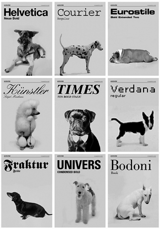
Something that is frequently agonized over in the magazine world is typography; the look and feel of fonts and how they relate to the subject matter at hand. True story! That is why we were thrilled to discover this clever graphic print over on Swiss Miss entitled “Dogs as Typefaces.” The concept is to pair each breed of dog with a font that best represents it. For instance, the poodle is matched with ‘Kunstler,’ a font that is a little bit fancy, most definitely elegant and beautifully poised — attributes that it shares in common with the pooch!
Naturally this inspired us to ponder what typeface would best suit Miss Rory. Being a mini-poodle/shih-tzu mix made pin pointing the perfect font rather challenging. We were hunting for something that reflected her soft and cuddly nature, while also imparting her curiousity, excitable energy, intelligence and expressiveness. After pouring through hundreds of different fonts the decision was finally made. Rory is…..

“Little Days!” This font is cute and cheeky. The loopy curves are friendly and playful, while the cursive constitution embodies a subtle sophistication as well as the never-ending energy that this little monkey lives by day in and day out. In fact we love Rory’s new font so much that we might just put it into our second issue, so keep an eye out!
So now you know. This is a mere sampling of the things we keep in mind when deciding on the fonts for the magazine. Fonts are a very big deal to any project’s design and we love discovering new beauties like we did today. So we’re dying to know — what font is your pet and why?
How fun! I just spent some time looking through fonts while glancing back and forth at my Boston Terrier, Bean… I think she’s “Honey Script”: http://www.fontsquirrel.com/fonts/Honey-Script
I ran across that fonts poster on tumblr a few days ago and thought it was great! I love the Times. :)